There is something endlessly frustrating when a news site launches a redesign that is a barely changed rehash of a large media companies older design.
Few, if any, media companies are backing up their design with user experience science. If the final sites are any indication, we have paid little attention to decades of significant study into UX and reader patterns. We shouldn’t be imitating them.
Instead, we try to determine design based on imaginary user stories and A/B testing. The problem is that when we treat humans as users, we forget to account for designing in a way that matches how real people read. When we A/B test there is the potential to find better designs that still aren’t good.
The first value every site design should solve for is readability. The people who come to news sites are there to read. Yet bad design patterns that challenge readability don’t just abound, they multiply.
The last few years have seen an explosion of low-contrast text, despite it being obviously harder to read.
Lines with too many characters also continue to plague websites, making them difficult to scan and forgetting the basic column-width lessons we learned laying out print newspapers.
The undifferentiated grid is another example of a common design pattern, which experienced growing popularity due to ease of scalability for responsive designs. A series of identical boxes makes no sense when compared to how our audience actually looks at the page.
This isn’t to say complexity is impossible, in fact we should consider it required.
- Abandon the “clean” design and build sites that respect our readers interest in finding the news.
- We can dig into scanpath theory and find opportunities to present visual complexity to inform the reader.
- It is to our financial advantage to do so, driving additional engagement and page depth.
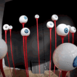
Studies exist to tell us how our audiences interact with pages in a general sense, we tend to ignore it. Understanding how our readers eyeballs work in the general sense means building designs informed not by trends or other news orgs, but by science. Much of that science is publicly available, waiting for us to use.
We can also start borrowing scientific methodologies to better understand our individual audiences and, in the process, connect with them. Eyetracking hardware is dropping in price, and is well within the range many news organizations should consider a purchase.
User studies are another way to take basic UX techniques and use them to improve your site and connect with readers. Reach out to the community and invite them to test draft redesigns or tweaks. Designers and developers should be observing and asking questions.
News organizations can give their audience the opportunity to interact with the people who make the site and learn what their preferences are directly. At the same time, your readership can begin to feel like they have a stake in how in building the site.
A nice after-effect? Making readers feel valued by your organization.
The first step is to use real data, the big kind that comes for complex scientific studies and the small kind that comes from talking design with our readers.
With better tools and connections into the community we can start driving better choices to impact how we build the news. The news media can start looking at atomic, delayed, or personalized news with the confidence that we can build whole new workflows for reportage that create better engagement with our audience.
This piece is for Carnival of Journalism.
Image via.
Source: Users, Humans and Eyeballs: Designing for News Readers


