Yesterday I went to the Museum of Modern Art in New York City. Completely by accident I stumbled across the exhibit Design and the Elastic Mind. The exhibit was fascinating. Among the most interesting things were the exhibit’s various re-tasking of old and new technology in new ways. Included in this was the idea of new interfaces and environments for vending and distinguishing media. Some of the interface ideas, both for man working with computers and man working with the world, have a lot of potential, and were quite remarkable.
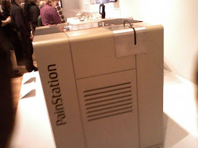 There was the PainStation, a device that allowed you to play a version of the game Pong, except with one major difference, it created feedback via pain in the left hand, which touched the “pain execution unit.” Consequences to missing the ball included heat, shocks or a “quick whipping on the back of the hand.” By combining sound effects and actual physical reactions it increased immersion in the game, making it a completely different experience. The closest we’ve gotten to something like that on the consumer level is rumble, but imagine how game play might change if consequences in a game were followed by, even minor, physical consequences.
Then there was New City. This was a display of a “virtual environment” that proposed to unite the entire world in on community. It was a city designed on a manifold, a “surface that forever folds onto itself, capturing endless dimensions of space and time.” The display was really quite beautiful and the concept is mind-boggling. Virtually designed and considered by the experts in the relevant fields, its creators, Imaginary Forces, see New City as the future of virtual worlds, and the remarkably designed visuals on display at the exhibit currently pointed in that direction. I can’t help but think about how many stories, each self generated between neighbors, would be in such a virtual environment. There are many stories in the New City…
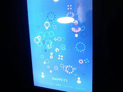
My favorite display in the exhibition was I Want You To Want Me. This was an “exploration of Web dating” that had been created for the exhibition. The single long screen allowed you to use touch to parse and sort through thousands of dating profiles broken down into their component parts, with the ability to change the interface background and some very soothing music, which actually sounded a lot like the music from Interactive Alice, which is what drew me to it in the first place. However, the interface was not only intuitive but allowed you to take some very interesting metrics of the online dating community. In addition, it was a lot of fun to use, building groupings of people by certain similarities, and, by glancing at a balloon, being able to take in a lot of information. The balloons’ colors were determined by age and sex. This was interesting in that it showed, not only the dating community, but also the possibilities inherent in a good design which makes the use of devices intuitive. Instead of menus and pull-downs–balloons. Despite its status as more art exhibit than anything else, I could see a device like this being sold and used.
In whole, the exhibition was fascinating and I highly recommend it if you happen to be in the area while it is open.






[…] What about a cloud format? Letting concepts float up and hover around? […]