Check out the new Facebook.
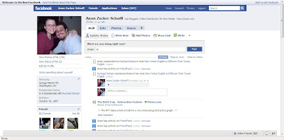
The new setup is very clean, it’s obviously a reaction to the overabundance of applications and the clutter they create on the main profile page. The reaction is to get rid of them. The new home profile page is clear of many of the annoying boxes that apps put up. However, it also means that apps which previously reported significant information to your mini-feed (FriendFeed being the big example as you can see in the screen shot) now do little more then show a basic update. It seems as if this can be changed in the app settings, but more verbose app reporting doesn’t seem to be working yet.
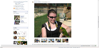
The new mini-feed, which has become the center of the New Facebook is highly media-friendly, with a focus on the output of built-in Facebook apps (the photo app shown here) and mini-feed in-line commenting (which looks to replace the wall).
To me, this seems almost like Facebook is admitting that the way apps are given access and have rolled out is a mistake. By relegating the majority of apps to the back of a profile page and forcing app reports (by default, which is how it will stay for majority of people who can’t figure out how to change app settings) on the mini-feed to be concise, the new Facebook takes most apps out of the equation.
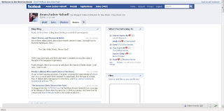
Is Facebook looking to lock out other services? As you can see, most of the apps, including FriendFeed, Last.Fm, and Goodreads are put on an entire other page.
It seems to me that this new Facebook design signifies a serious shift. Is Facebook looking to move away from becoming a portal of ‘everything you’ and towards a more streamlined and introverted activity tracker?
With the main wall being a huge mini-feed, will this force out those users who see Facebook’s mini-feed as little more than stalker-ware? This design makes obvious that Facebook’s primary purpose is for tracking people’s activities. Even the profile information is stuck on a secondary page.
